The moment a small product business commits to printing labels is the moment everything gets expensive.
Minimum orders are large, plates and setup are charged whether you print five hundred or five thousand, and a mistake discovered afterwards is a pallet of unusable stock in a storeroom. Everybody in this position has heard the story about the batch where the weight was wrong, or the address was the old one, or the artwork was supplied without bleed and came back trimmed into the text.
What makes it harder is that packaging artwork is two different jobs wearing one deadline. Part of it is design, which benefits from exploring options. Part of it is regulatory, which benefits from nothing except being exactly correct.
GPT Image 2 with practical workflows through Higgsfield is genuinely useful for the first half and should stay well clear of the second, and knowing where that line sits is most of what this article covers.
What actually goes on a product label?
More than new sellers expect, and the list is longer for anything edible.
There is the brand side, which is the product name, the logo, the descriptor telling somebody what the thing is, and whatever artwork carries the identity.
Then there is the information side. Net quantity. The business name and a contact address. Country of origin. A batch or lot code. A date mark where one applies. Storage and usage instructions. For food and drink, a full ingredients list with allergens distinguished from the surrounding text, and nutrition information.
For cosmetics, household chemicals, electricals and toys there are further requirements again, including warnings and conformity marks.
The brand side is a design problem and the information side is a compliance problem, and GPT Image 2 belongs firmly on one side of that, and mixing the two into one task is how small businesses end up reprinting.
Which parts are fixed by law?
Enough that this part should be settled before any artwork is drawn.
Mandatory particulars vary by product category and by market, and several of them carry rules about how they appear rather than just whether they appear. Minimum type sizes apply in some cases. Allergen information has to be distinguished from the rest of the ingredients. Certain information must sit within the same field of vision as other information. Some markets require specific language versions.
None of that is a creative decision, and the sensible approach is to get the mandatory content confirmed in writing, ideally from somebody who does this professionally or from the relevant guidance for your category, before a designer or a generated image gets anywhere near it.
Once that content exists as plain text with its rules attached, the GPT Image 2 work becomes arranging around a fixed set of constraints, which is a considerably clearer brief than starting with a blank label.
Where does the design effort really go?
Into the part that is genuinely discretionary, which is smaller than it feels at the start.
The colour and the pattern. The illustration or photographic element if there is one. The typeface for the brand name. The texture and finish of the material. How the product reads on a shelf next to competitors, and how it reads as a thumbnail on a listing page, which are different problems.
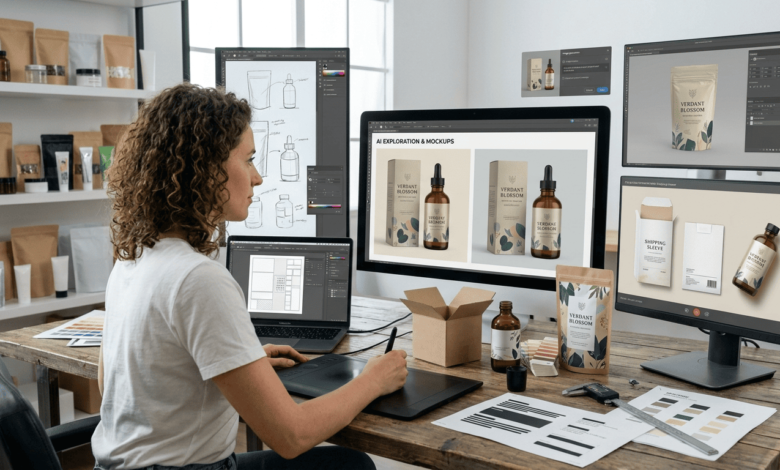
And crucially, how it all looks on the actual container. A label is not a rectangle. It wraps a jar, curves around a bottle, folds over the edge of a box. Artwork that looks balanced flat frequently does not once it is on the product.
That last point is where most of the wasted effort goes, and where GPT Image 2 saves the most, because judging it has traditionally meant printing a sample, which costs time and money, or imagining it, which is unreliable.
What can GPT Image 2 produce for packaging?
The visual and exploratory side, at a speed that changes how many options get considered.
Background patterns and textures, produced to a described style rather than licensed from a library where competitors are shopping too.
Illustrative elements for the brand side of the label, in a consistent style across a range.
Colourway exploration, which is where a small business usually settles too early because each variation was expensive to produce.
Label concepts as complete compositions, useful for deciding a direction before any of it is set properly.
And mockups of the finished product, which deserves its own section because it is the strongest case.
GPT Image 2 also renders text considerably better than earlier image models, which makes concept work legible rather than approximate. That is a genuine improvement for presenting an idea, and it is not the same thing as producing print ready type, which the layout section covers.
Why are mockups the strongest use?
Because seeing the design on the actual container answers questions nothing else does.
A flat artwork file tells you very little about whether a label works. Put the same design on a jar, under shop lighting, next to two other products, and the answers arrive immediately. The name is too small. The pattern dominates. The colour that looked rich on screen disappears against brown glass, and fixing those issues after printing costs money.
Producing those views used to mean a sample print run or a skilled mockup artist. GPT Image 2 generates the product in context from the artwork and a description of the container, which means a decision that previously waited two weeks can be made in an afternoon.
It also improves the conversations around the decision. Showing a partner, a stockist or a buyer a picture of the product on a shelf is a different exchange from showing them a rectangle. People respond to the thing rather than to the file.
And it prevents expensive commitment. The purpose of a mockup is to be rejected cheaply, and the more of them a business can produce, the less likely it is to print the wrong one.
What belongs in layout software instead?
Everything legal, everything measured, and anything the printer will need to modify.
The mandatory information should be set as live text in proper layout software rather than produced in GPT Image 2, because it needs to be exact, editable, checkable and reproducible at a specified size. Type that has been generated as part of an image cannot be verified in the same way and cannot be corrected without regenerating.
Certification and conformity marks should come from their official sources, never generated. Recycling symbols, organic certification marks, safety and conformity marks and similar are controlled, they have defined proportions and usage rules, and an approximation is both wrong and potentially a compliance problem. Use the files supplied by the issuing body.
Barcodes must come from the encoding software, since a barcode is data rather than a picture.
And dimensions must be exact. Die lines, bleed, safe margins and trim are measurements rather than aesthetics, and they come from the printer’s template.
The practical division that works: generate the artwork in GPT Image 2, place it in the template, set the type properly on top, proof the whole thing.
What does the printer need from you?
Ask before designing anything, because it changes the file you should be building.
A template with the die line for your exact container and label shape, showing the trim, the safe area and how much wraps around.
Bleed, usually a few millimetres beyond the trim, so nothing white appears at the edge if the cut drifts.
Resolution at final size, which for print is considerably higher than anything screen based. GPT Image 2 artwork generated for a mockup is frequently not sufficient for the press, and generating at the largest available size matters when print is the destination.
Colour mode, since print and screen use different systems and a colour that looks correct on a monitor can arrive noticeably different.
And a proof process. Most printers will supply a digital proof and some will supply a physical one. Physical is worth paying for on a first run.
How does Higgsfield handle a product range?
Higgsfield is an AI creative suite, which here means the generation, the adjustment and the export sit in one place rather than across separate tools nobody has time to learn.
Consistency across a range is the main argument. A business with eight products needs eight labels that are obviously siblings, differing in flavour, scent or variant while sharing an identity. Settling the treatment once and having Higgsfield store it is what produces that, rather than eight decisions made on eight separate evenings.
Saved GPT Image 2 descriptions matter more here than in most applications, because packaging gets revisited. A new variant next spring should match the range it joins, and the wording that produced the original artwork is what makes that possible a year later.
Attempts stay side by side, which is how colourway decisions actually get made. Six versions viewed together settles a question that six versions viewed sequentially does not.
Reference material stays with the project, so the container shape, the existing brand assets and any approved artwork anchor whatever comes next.
And it runs in a browser, which for a business where this happens after the day’s orders have gone out is the relevant consideration.
What about seasonal and variant packaging?
Worth planning for, because it is where most of the repeat work lives.
Gift editions, seasonal colourways, limited runs and bundle packaging all need artwork that belongs to the core range while looking distinct. That is a variation problem rather than a design problem, and variation is exactly what a saved treatment plus a changed brief handles well.
Produce these early. Seasonal packaging has a print lead time and a sales window, and GPT Image 2 concepts cost an afternoon, and the businesses that struggle are the ones designing in October for a November print. Generating concepts in summer costs nothing and removes the panic.
And keep the previous year available, because the second year of any seasonal line is mostly a refresh, provided anybody can find what was used the first time.
What does this change about how often you redesign?
More than the first label, and it is the part worth thinking about before committing to anything.
Most small product businesses redesign packaging far less often than they would like, because each round costs money and nerve. The label that went out in year one is frequently still going out in year four, not because it is right but because changing it means new artwork, new plates and a decision nobody wants to make twice.
Cheaper exploration changes that calculation. Producing six directions in GPT Image 2 and mocking them onto the container costs an evening, which means a business can test whether a refresh is worth it before spending anything on print.
It also makes range extensions realistic. Adding a ninth product to a range of eight has historically meant either matching the existing artwork by eye or paying to have it matched properly. A saved treatment in Higgsfield means the new variant inherits the range rather than approximating it.
And it helps with stockist conversations. A buyer asking whether the packaging could work in a different size, a different finish or a gift format can be answered with a mockup the same week rather than with a promise. That responsiveness is worth more to a small supplier than the artwork itself.
The one thing that does not get cheaper is the print run, which is why the mockup stage matters. Everything that can be decided before the plates are made should be decided there.
How would a first label go?
In a sensible order, which is not the order most people use.
Confirm the mandatory information first, as plain text, with any rules about size or placement noted. This is the constraint everything else works around.
Get the printer’s template for your exact container before designing.
Generate several artwork directions in GPT Image 2, deliberately more than you need, and view them together rather than one at a time.
Mock the shortlist onto the actual container, in context, and look at them as a customer would rather than as the person who made them.
Then build the real file in layout software, placing the chosen artwork into the template and setting all the mandatory information as live text.
Proof it twice, once yourself against the mandatory list and once with somebody who has not seen it before.
And order a physical proof before the full run, which is the cheapest insurance available in this whole process.
FAQ’s
Can GPT Image 2 design a complete label?
It produces the artwork side well and should not be used to set the mandatory information, which needs to be live text in a layout file so it can be checked and corrected.
Is GPT Image 2 text good enough for packaging?
For concepts and mockups, yes. For the printed article, set the type properly, since anything legally required must be exact and verifiable at a specified size.
What about recycling or certification symbols?
Always use the official files from the issuing body. Those marks have defined proportions and usage rules, and an approximation creates a compliance problem.
Can it show the design on an actual jar or bottle?
Yes, and mockups are the strongest use for it, because decisions about scale and legibility only become obvious once the artwork is on the container.
Will GPT Image 2 resolution be enough for print?
Generate at the largest size available and check the dimensions against what the printer requires at final size, since print needs considerably more than screen.
How do you keep a whole range consistent?
Settle the treatment on one product and reuse it. Higgsfield stores what produced it, so a variant added next year still matches.
Conclusion
Packaging goes wrong because two different jobs share one deadline. The artwork wants exploration and the mandatory information wants precision, and treating them as a single task usually means one of them suffers.
Separating them fixes most of it. GPT Image 2 handles the exploration, the colourways and above all the mockups that let a decision be made before anything is committed, while Higgsfield keeps a range looking like a range as it grows.
Then set the legal information properly, place it in the printer’s template, and order a physical proof. The pallet in the storeroom is the expensive way to learn that last part.